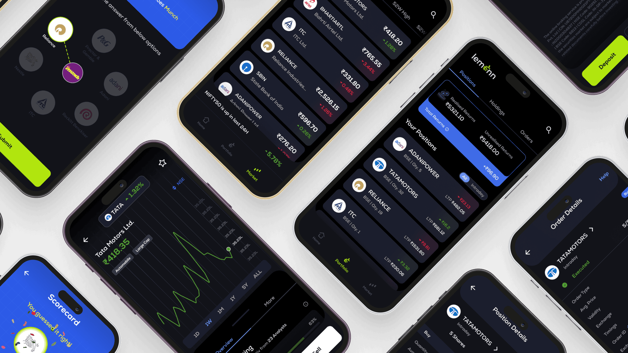
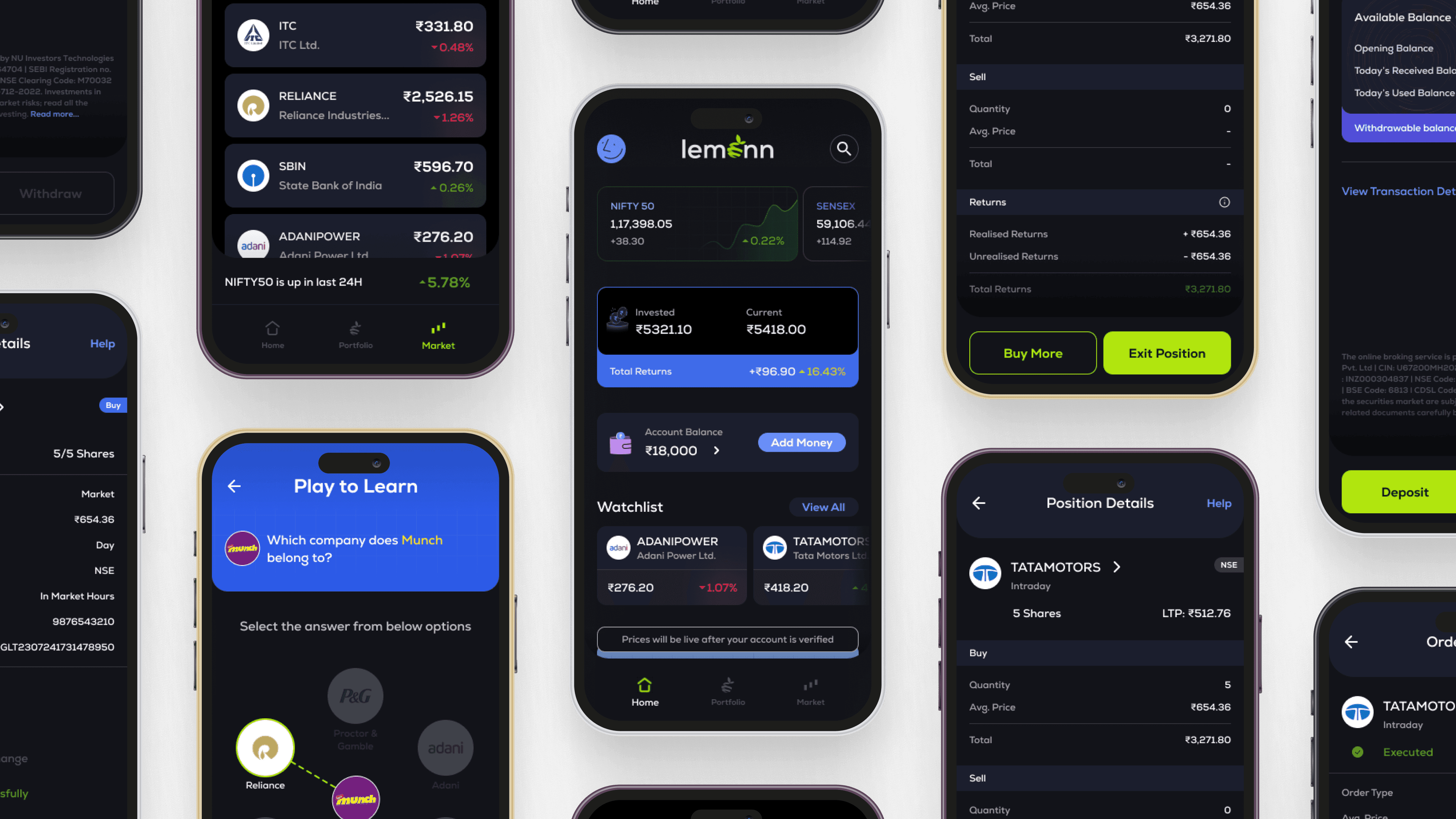
Lemonn - Phase 2
UI/UX
Design Lead
Timeline
Apr'23 - Mar'24
(11 Months)
Focus
User Research, MVP Strategy, UI/UX Design, Launch
Outcome
Acquired 2.5L users in <3M
From Approval to Adoption - The Launch Phase
How strategic UX transformed a complex financial product into a simple, trustworthy, and educational experience for 250,000+ new users within 3 months of launch.


Problem Statement
Aiming to enable users invest in Indian Stocks through clear understanding by simplifying flow, minimising jargons and increasing discoverability within the app which in turn brings down the learning curve.
Research Insights


551 Respondents
66.6% Invest in stocks
27.22% haven't invested but plan to
A Market Ripe for Growth
The data shows a strong inclination towards Indian equities :
A significant 66.6% of respondents are already active investors in Indian stocks.
An additional 27.22% are poised to enter the market, indicating a substantial pool of future users.
The majority of these investors are relatively new, having entered the market
within the last 2 years, suggesting a burgeoning interest and potential for nurturing new users.
Investors, Not Just Traders
We found a clear preference for long-term growth :
Over 70% of respondents identify as "Investors" rather than "Traders," highlighting a desire for tools that support strategic, sustained portfolio growth.
The Research Hurdle : A Universal Challenge
A critical pain point emerged across the board :
The biggest hurdle for both current and prospective investors is the lack of knowledge on how to research and select the right stocks. This presents a prime opportunity for platforms to offer intuitive guidance and educational resources.
Groww's Dominance & Platform Gaps
While some platforms lead, significant opportunities exist :
Groww is the preferred platform for over 40% of respondents, indicating a strong contender in the market.
However, users expressed clear dissatisfaction with existing platforms, citing a lack of investment advice, high brokerage charges, and difficulties in managing and tracking their portfolios. These are critical areas for innovation and differentiation.
Addressing Skepticism: Building Trust and Understanding
For those not yet convinced, we identified key barriers :
The primary reasons for disinterest were previous losses and a lack of understanding of how the stock market functions. This underscores the need for platforms to build trust through clear, accessible education and risk management tools.
These insights are instrumental in shaping a user-centric design that addresses real user needs and empowers them to navigate the equities market with confidence.
Research: Understanding the Competitive Landscape
To design a truly differentiated product for first-time investors, we first needed to understand the existing market. We conducted a thorough competitive analysis of the leading investment platforms in India to identify established user patterns, uncover market gaps, and define opportunities for Lemonn to innovate.
Our goal was to answer key questions :
What are the common user flows for critical tasks like KYC, finding a stock, and placing an order?
Where do existing platforms excel, and where do they create friction for new users?
How can we leverage these insights to create a simple and trustworthy experience?
We analysed five major competitors :

Groww

Upstocks

Zerodha

Dhan

Angel One
Feature-by-Feature Analysis
Instead of just looking at the platforms holistically, we broke down the experience into core features that are most critical to a new user's journey. The list on the left represents the full scope of our audit, from onboarding (KYC) to post-investment tracking (Reports).
Key Strength
Key Weakness for New Users
Opportunity for Lemonn
Competitor
Zerodha
Powerful tools for pro traders, industry-leading reliability.
Interface is dense, jargon-heavy, and intimidating for beginners.
Focus on Simplicity: Create a UI that abstracts away complexity, prioritizing clarity over exhaustive features.
Groww
Excellent, clean UI with a strong focus on mutual funds and simple discovery.
Stock discovery is good but still relies on users knowing what to look for.
Guided Discovery: Go beyond simple lists. Introduce thematic "Collections" and brand-based discovery to solve the "what to buy?" problem.
Upstocks
Strong branding and feature set, appeals to a slightly more savvy user base.
Onboarding and order placement have multiple steps that can cause friction.
Streamline Core Flows: Design a best-in-class, frictionless onboarding and a simplified one-page order pad.
Dhan
Innovative features tailored for active traders (e.g., advanced charting, options).
Overwhelming for someone who has never invested before. Caters to a power-user niche.
Own the Beginner Niche: Double down on educational features and confidence-building tools, rather than competing on pro features.
Angel One
Long-standing brand trust and a wide range of investment products.
The user experience can feel dated and less cohesive compared to newer platforms.
Modern & Cohesive UX: Deliver a polished, modern, and intuitive user experience that builds trust through superior design.
Key Findings & Opportunities
Our analysis revealed several key themes and strategic opportunities, summarised below.
Defining Our Visual Strategy: A Modern & Cohesive UX
The analysis revealed a clear opportunity: while some competitors were functionally powerful, their user experience often felt cluttered, dated, or intimidating. We identified that a superior, modern, and intuitive design could be a key differentiator and a primary driver of trust for new users.
Defining Visual Direction
To define the visual direction, we created a mood board, collecting inspiration from best-in-class apps, both within and outside the finance domain.
This exercise helped us establish four core principles for Lemonn's UI/UX:
Clutter-Free & Minimalist Design
We committed to a clean interface that prioritizes the most critical information, reducing cognitive load and helping users focus.
Strategic Use of Visuals
We planned to use friendly and accessible illustrations to break the monotony of data-heavy screens and make the app feel more approachable.
Clear Typographic Hierarchy
A strong, consistent typography system would be used to guide the user and ensure readability, making complex information easier to understand.
Information Architecture
We would organize content logically from a beginner's perspective, ensuring that users could navigate the app with ease and confidence.


Iterate . Improve . Repeat
Following research and analysis, we swiftly moved into wireframing. Low-fidelity screens were created first, then quickly translated into high-fidelity designs. With key flows already in place, we iterated rapidly based on ongoing stakeholder feedback.


